Open Banking · Credit reference
Open Banking challenger credit reference platform
A platform for underwriters to assess lending risk using consented bank account data—faster decisions with less manual statement review.
Problem
An underwriter faces two main challenges when doing their job. First, they have to evaluate lending risk for each borrower individually to ensure the borrower is a sound investment and will pay back the loan. Second, they need to manually check each borrower’s financial records, such as bank statements, to understand behaviour—which is often very time-consuming. Most underwriting teams are not well equipped to deal with these challenges at scale.
Goal
The goal was to create a platform with instant access to a potential borrower’s bank accounts through Open Banking. Presenting that information in a cohesive, process-oriented way should allow an underwriter to reach a conclusion much faster and to approve, decline or reassess a loan request at significantly lower cost in time, money and internal resources.
Design process
I started by learning what underwriters face day to day and by researching competitors in credit reference and Open Banking. I formed a hypothesis, mapped user flows, then designed wireframes and interfaces—prioritising the most important and common actions. Because underwriting is complex, the designs stayed clean and intuitive. When the screens were ready, I built a high-fidelity prototype and ran usability testing.

User flows
Wireframes
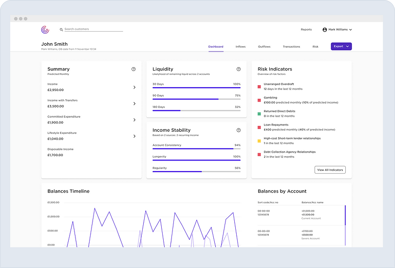
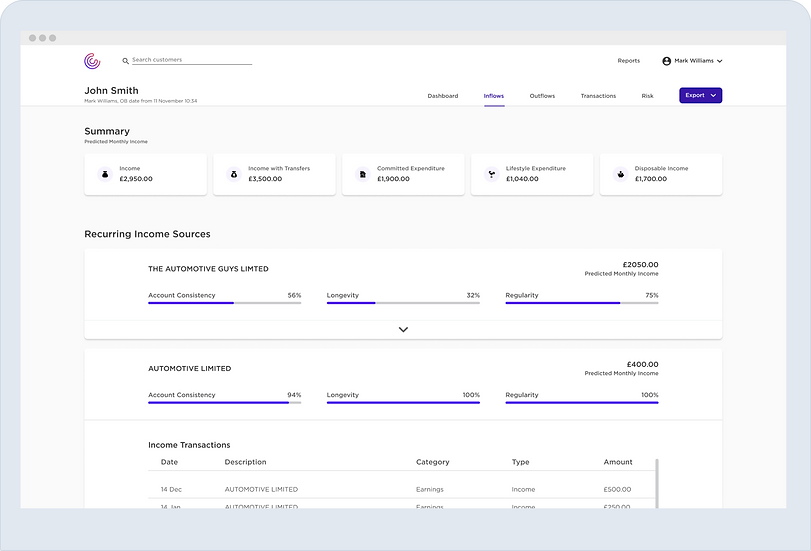
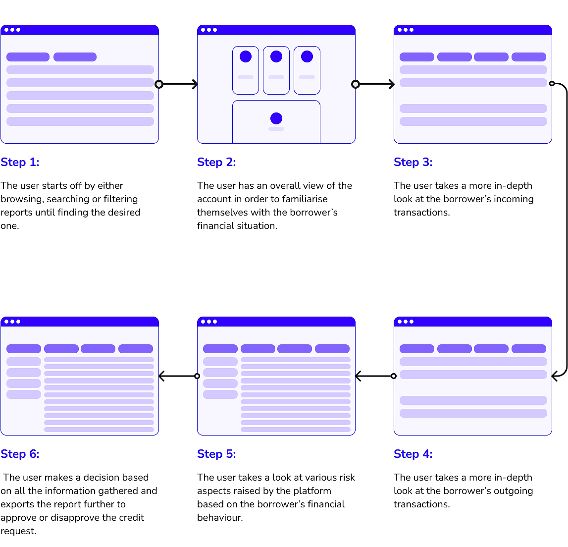
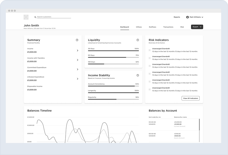
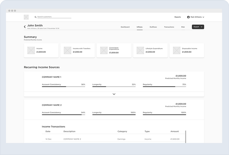
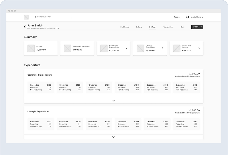
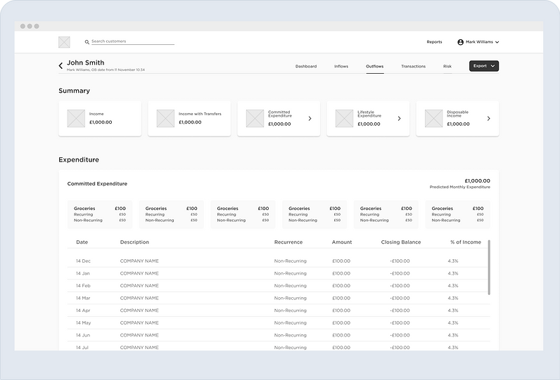
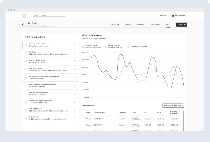
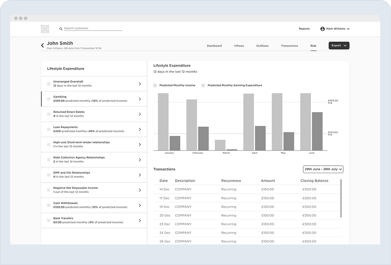
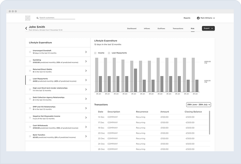
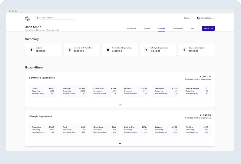
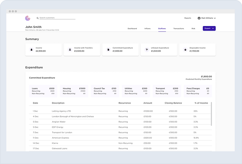
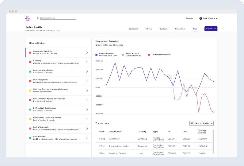
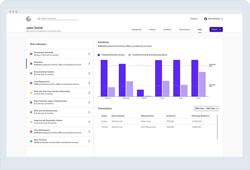
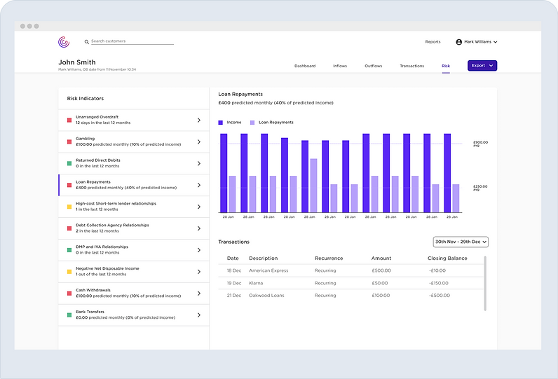
Wireframes followed the process an underwriter goes through to reach a decision. The platform extracts what is needed—income, transactions (with date and time), overdraft information and more—surfaced on the Dashboard. That data supports income and affordability assessments and vulnerability checks, organised so it is easy to scan. Inflows, Outflows, Transactions and Risk views carry that structure through.
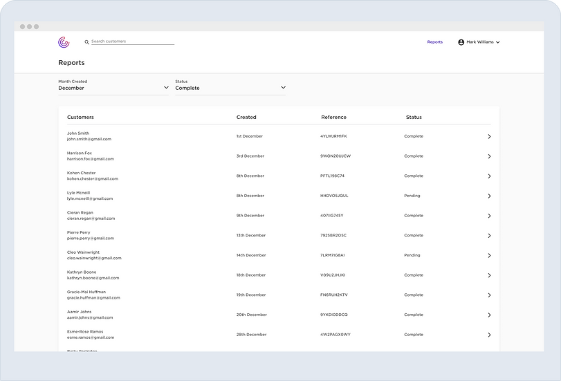
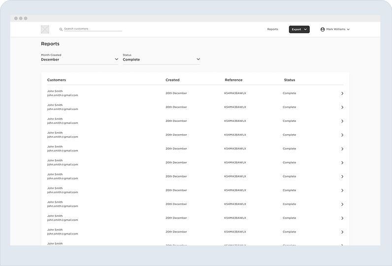
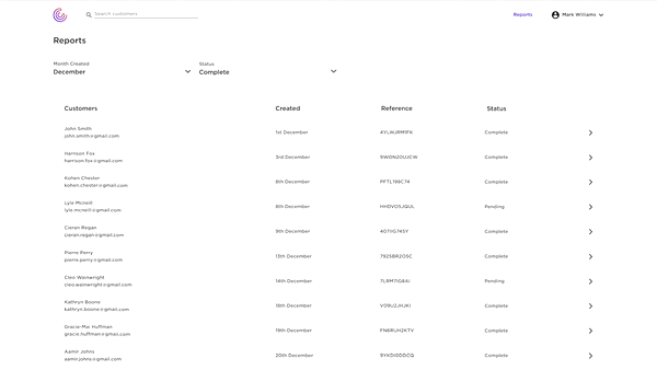
Because underwriters juggle many profiles, the Reports page lists pending and complete requests and is the first screen after login. From there they search or filter, then open a profile to go deeper.
User interfaces
The UIs follow the wireframes closely: minimalist and airy so underwriters can focus. The main change is a clear colour scheme for hierarchy and state.
Usability testing
I tested with people who had financial backgrounds. Although they were not underwriters, they found the prototype intuitive and were confident they understood the criteria for approving a borrower. They were also happy with how information was split across tabs.
Outcome
The high-fidelity prototype felt intuitive and distraction-free, with low friction. Tasks that usually demand heavy time and effort became straightforward, which in turn could improve underwriter performance and reduce risk for a challenger credit reference business.