Letter of Credit · Document Request
Document Request
Designing the document-request step for Letters of Credit

Context
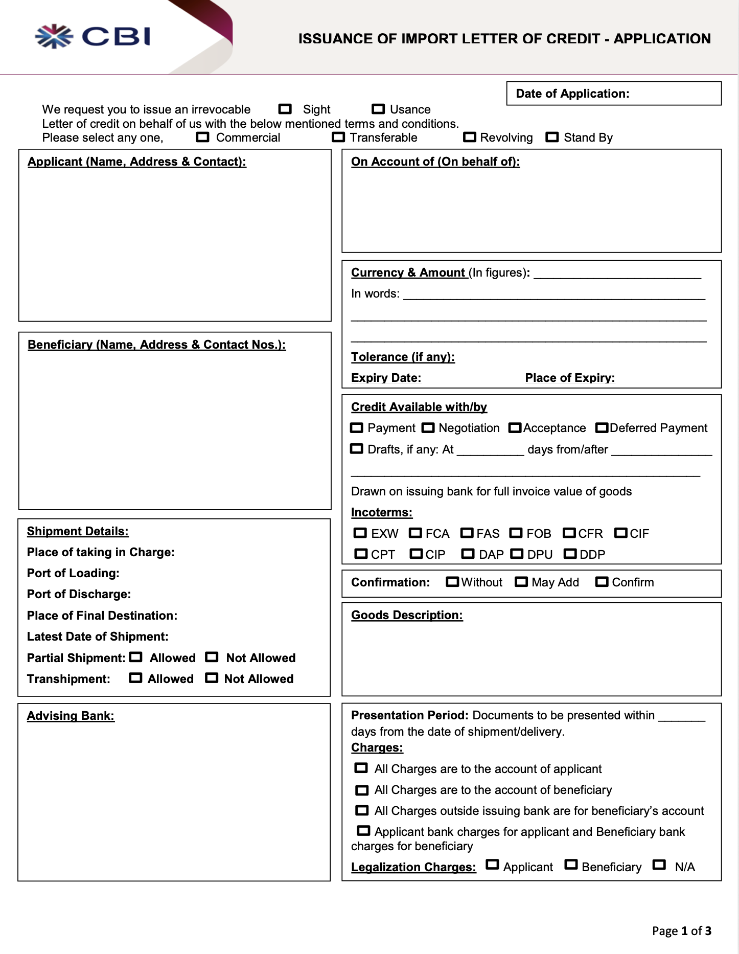
Letters of Credit are used in international trade to lower risk. Payment only gets released once certain conditions are met, which makes them complex by nature. There are strict rules, exact terms and conditions that carry legal weight. The document request is the part that defines the exact documents a seller has to provide before they get paid.
Problem
Two things were true at the same time. The content was expert level and carried legal weight, so I couldn’t reword it or cut it. However, the person filling it in was the importer applying for the Letter of Credit, who are not necessarily Trade Finance experts.
The old paper forms threw everything at them as one dense block of fields with no structure. That made mistakes easy and hid them when they happened. A mistake here delays payment or releases it when it shouldn’t. So the problem was never about making it simpler. It was about getting a non-expert through something genuinely complex without losing any of the detail that mattered.
Constraints
The easy move would have been to simplify by cutting or rewording things. That wasn’t an option here.
The exact legal wording had to stay
Some information had to be displayed in a specific order
Content couldn’t be moved to other steps even if a section felt heavy
The Design System presented some limitations
So the brief set the challenge. Keep every requirement, every term and the original order while making it something a first-timer could get through in a flow where mistakes are costly.
Discovery
This project had to move quickly, with the core experience progressed within a one-month window. Because there was limited time for primary research, I used the strongest available inputs: RFP requirements, client feedback, support tickets and patterns from similar trade finance journeys.
I also worked closely with the business PM and engineering team throughout, using their input on legal, business and technical constraints to shape realistic design decisions early rather than treating engineering as a final handoff.
Proxy signals
- Support tickets
- RFP requirements
- Client calls
- Similar business banking journeys
Design priorities
- Clarify document requirements
- Reduce missing or incorrect documents
- Support review before submission
UI decisions
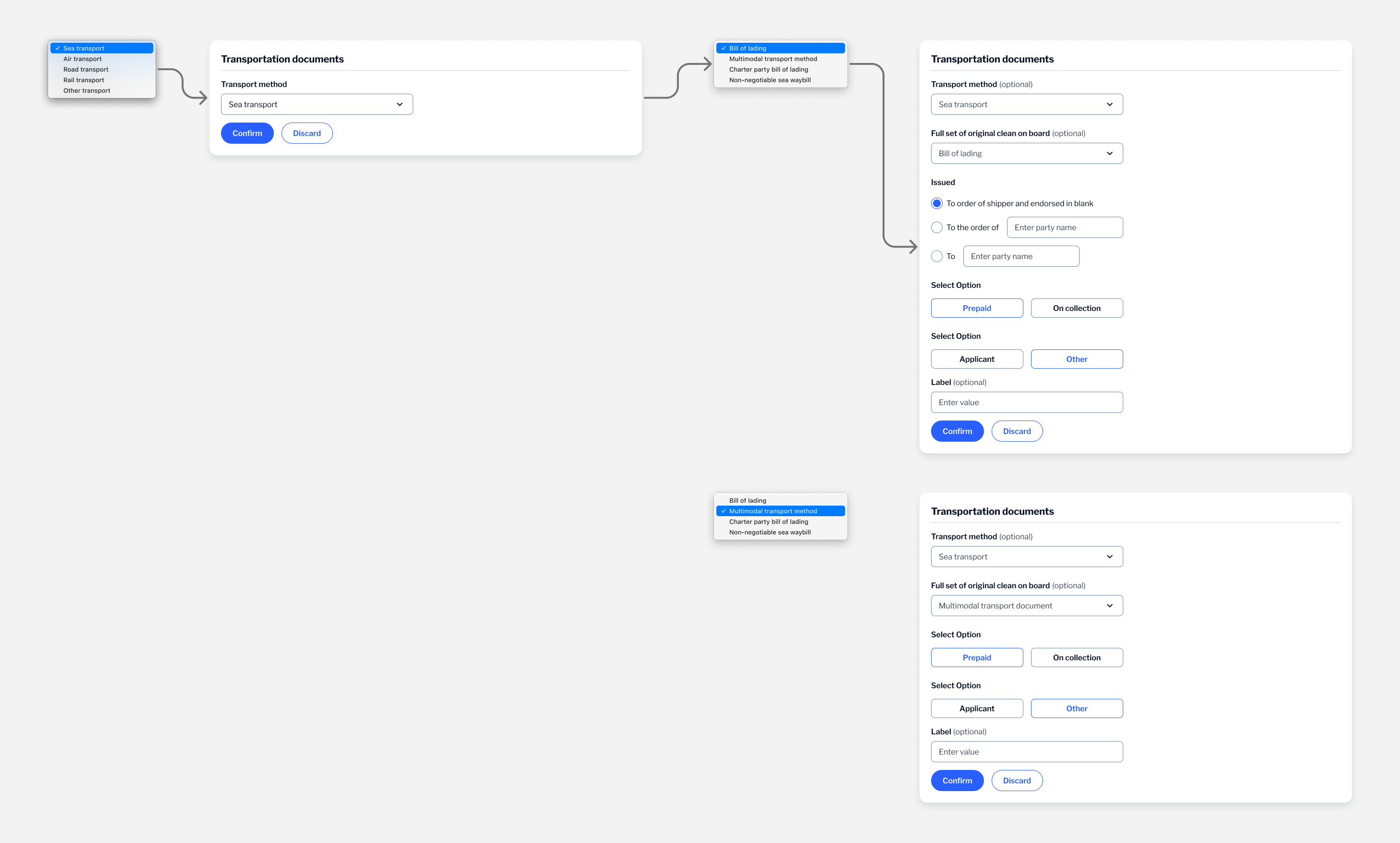
- Add one document at a time
- Show added documents as summary cards
- Allow edit and review before continuing
Challenges
The document request step had to be handled carefully. While it might seem like something that could be simplified, the information needed to stay clear and accurate, which meant I couldn’t move too far away from the original wording. In some cases, the exact terminology had to be kept.
The structure of the information also followed a logical sequence that couldn’t be changed, so I had limited flexibility in how I could reorganise it. On top of that, the design system restricted how certain elements could be presented, which further shaped the solution.
There were also limits on moving information between steps. Even though some sections felt dense, the content had to stay within this step to make sense in the overall process.
Approach
Since I couldn’t reduce the information, I focused on how it was laid out instead. Two things shaped it:
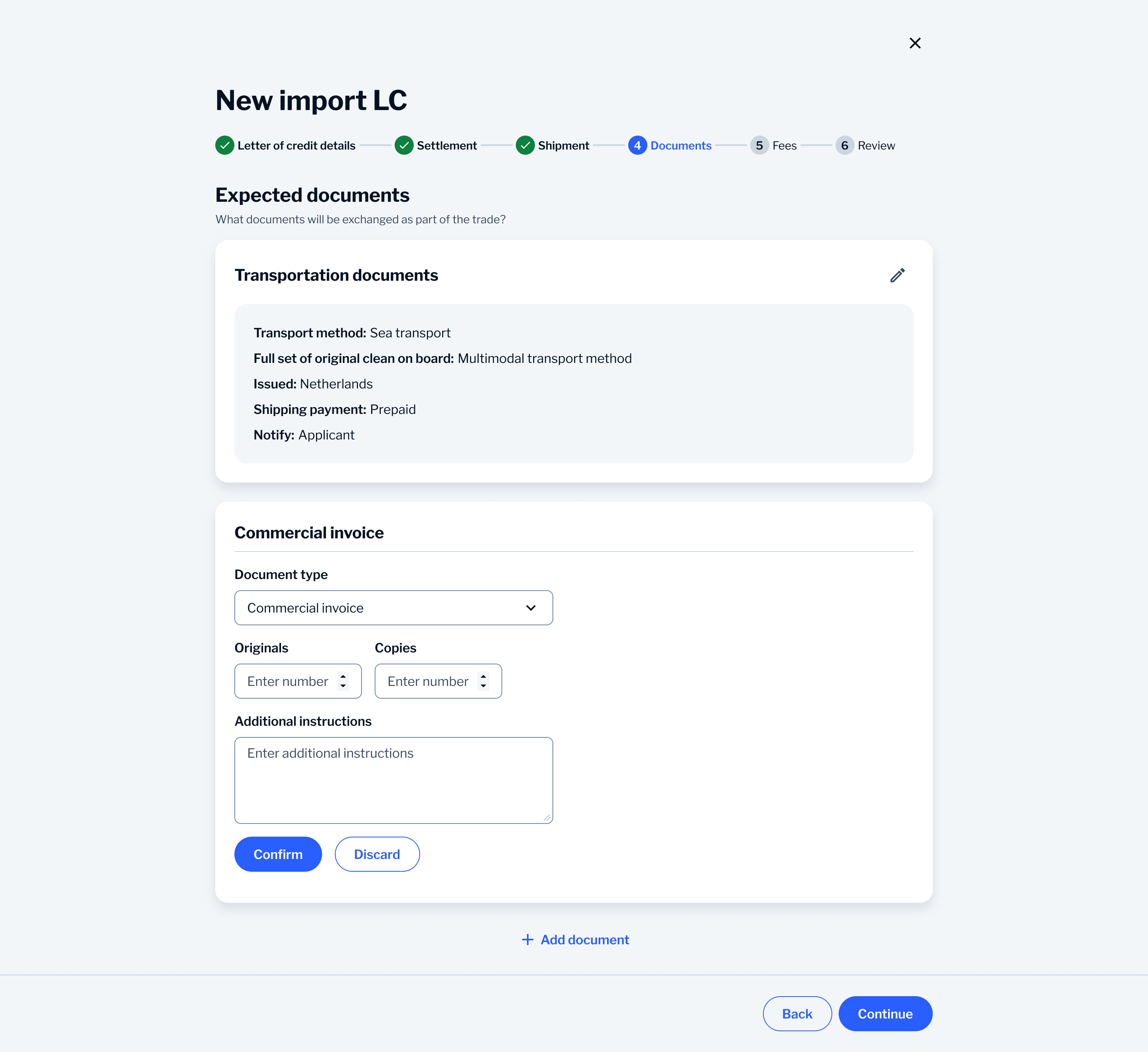
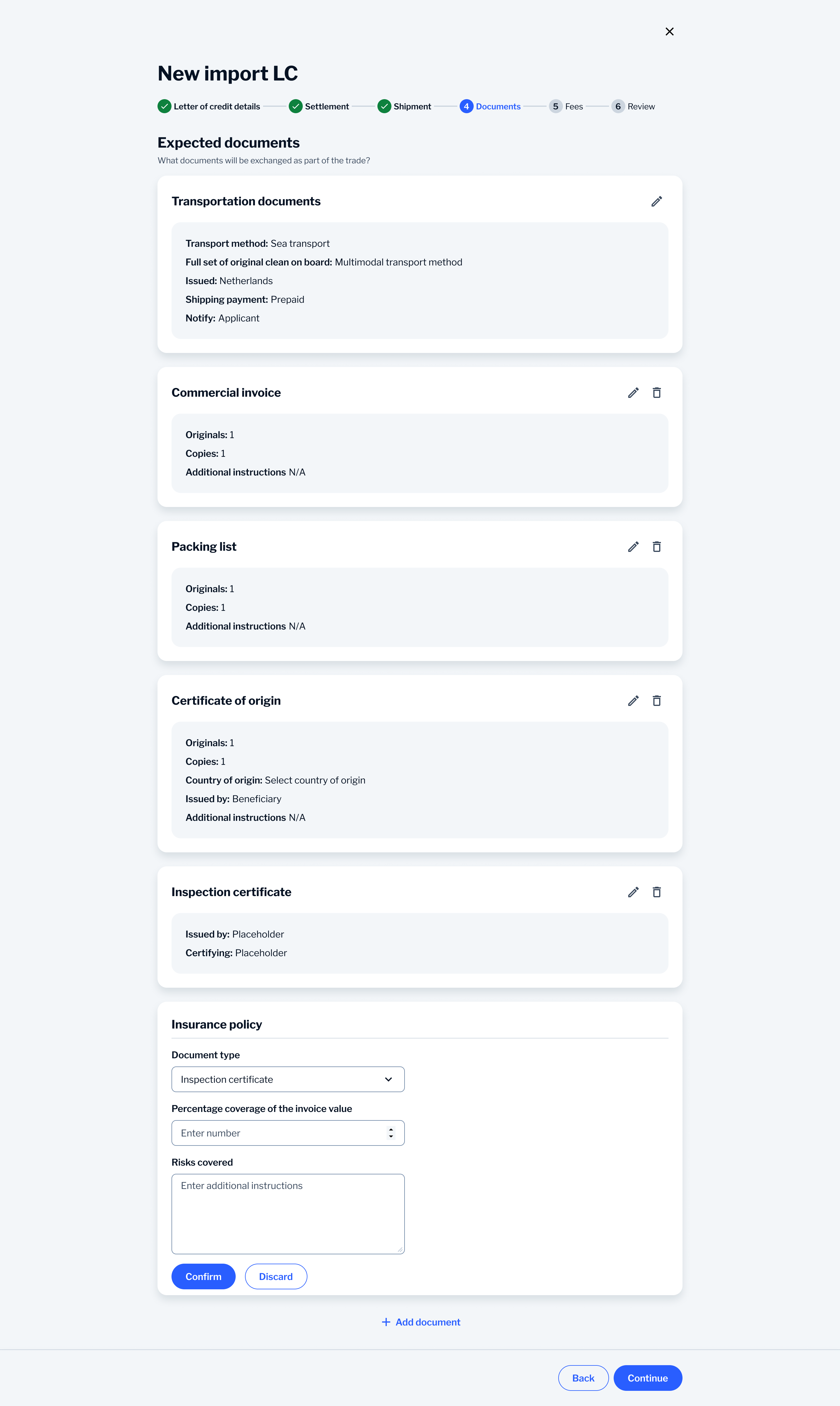
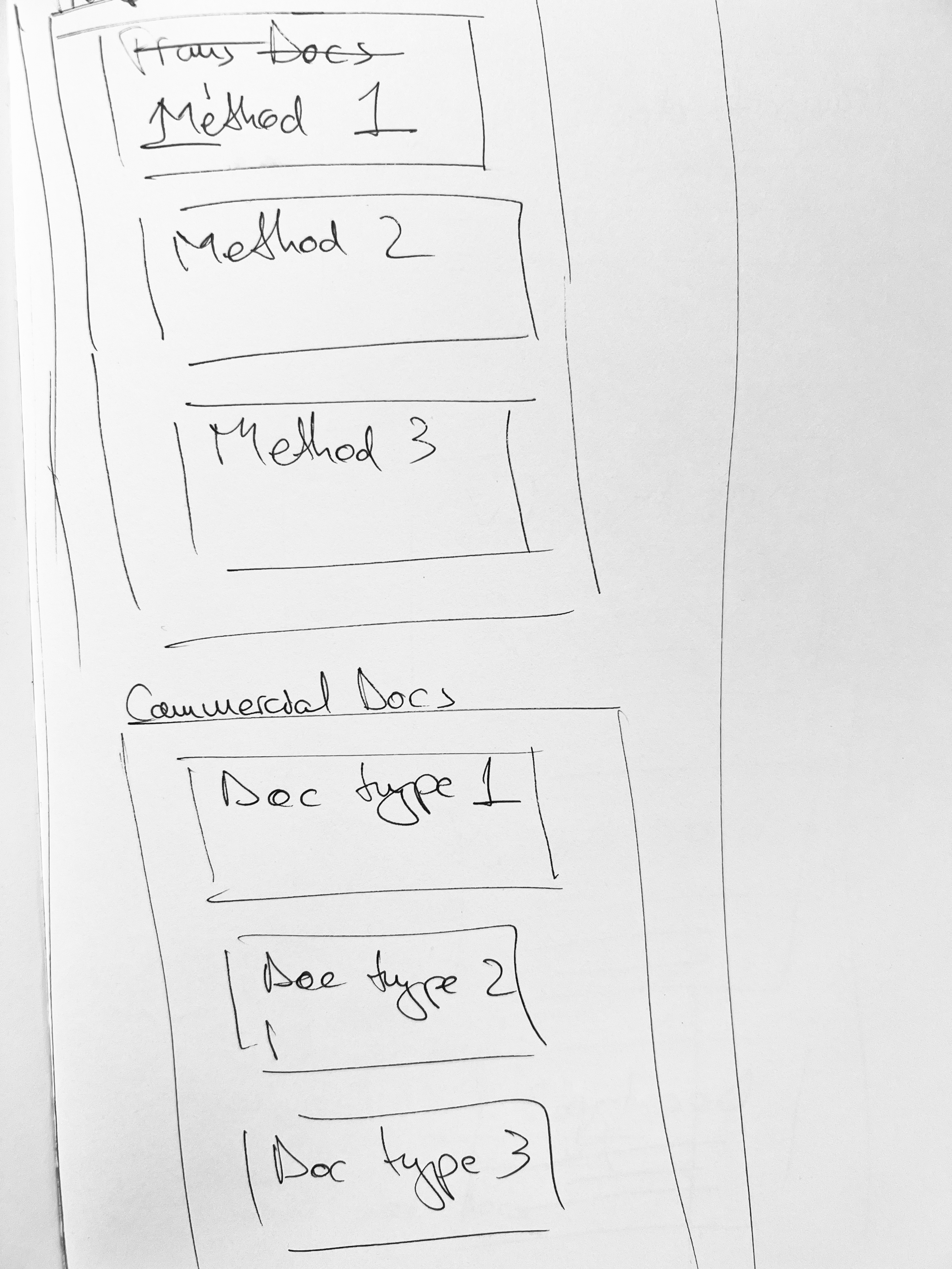
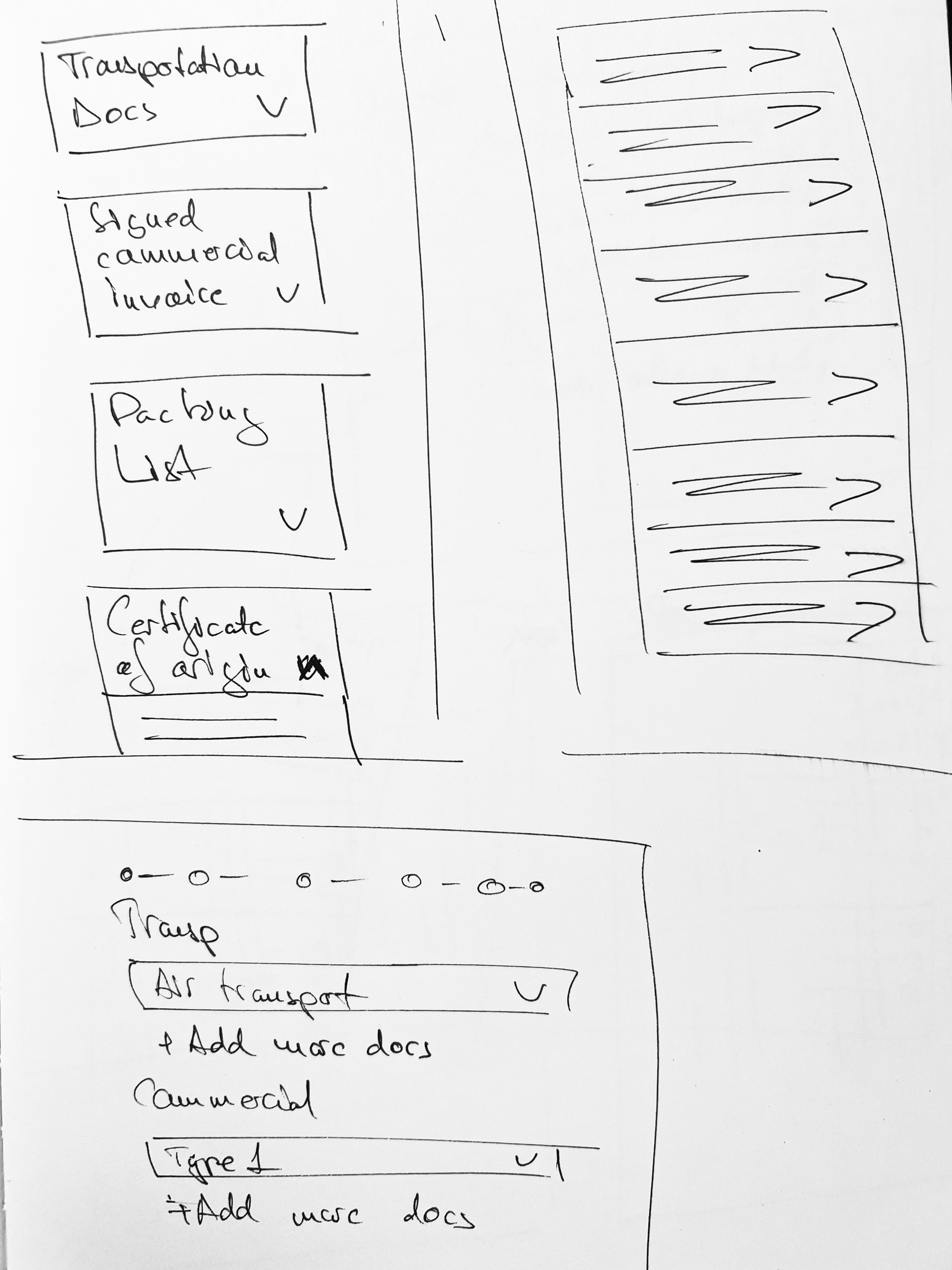
1. Every Letter of Credit needs a different mix and number of documents. One big fixed form would be mostly empty fields you don’t need and not in the best order. So instead the user builds their list one document at a time. That matches how the request actually works.
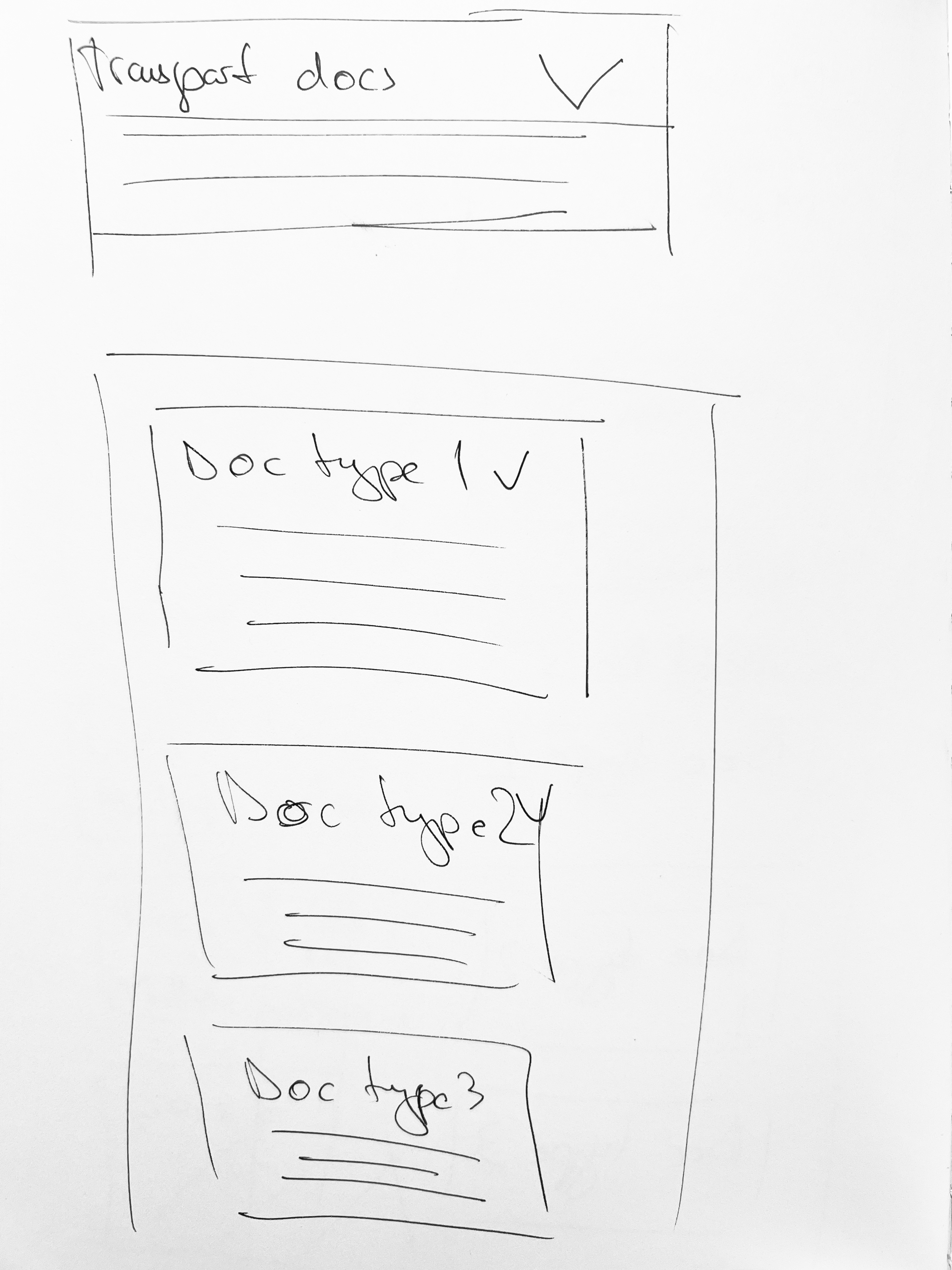
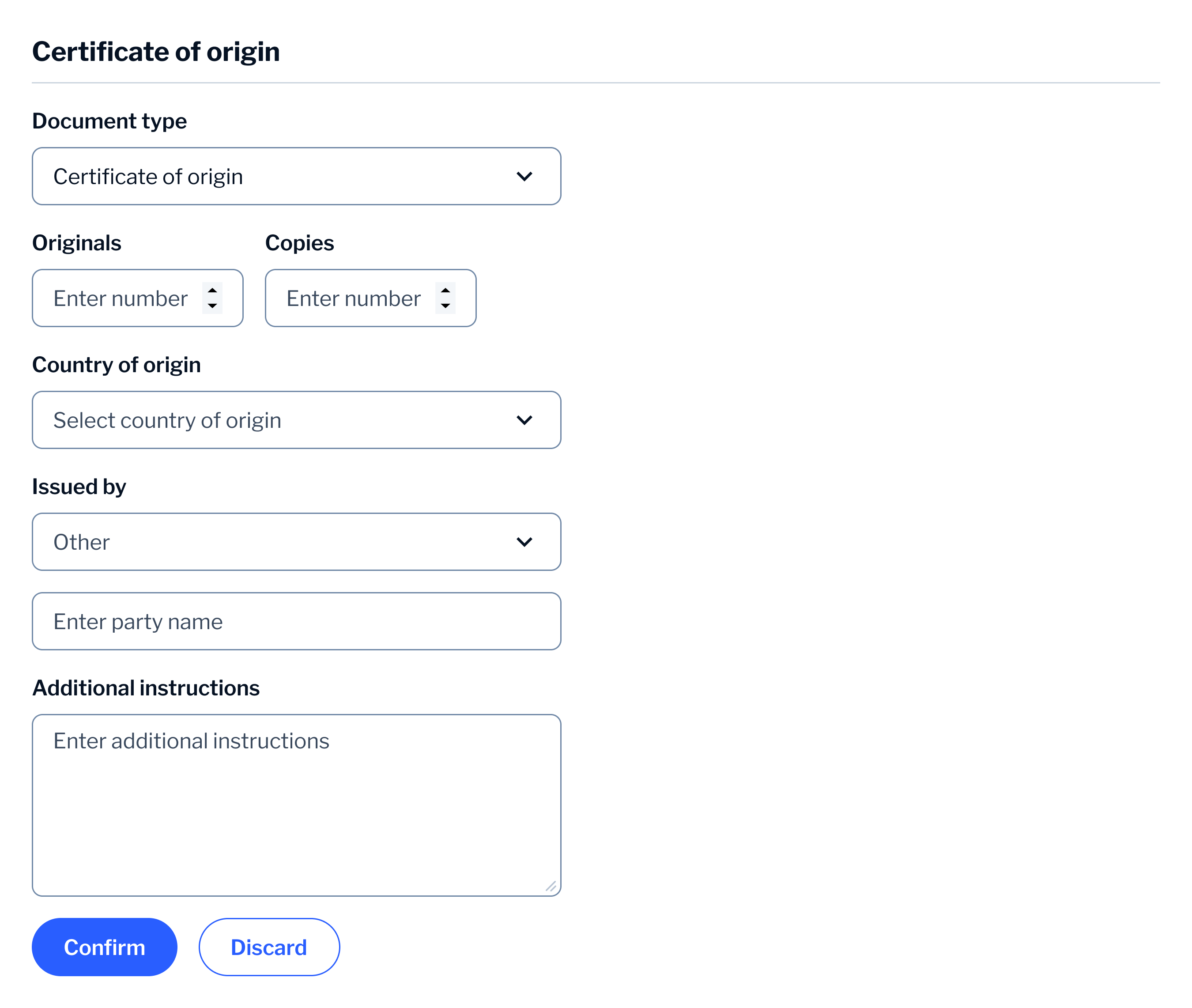
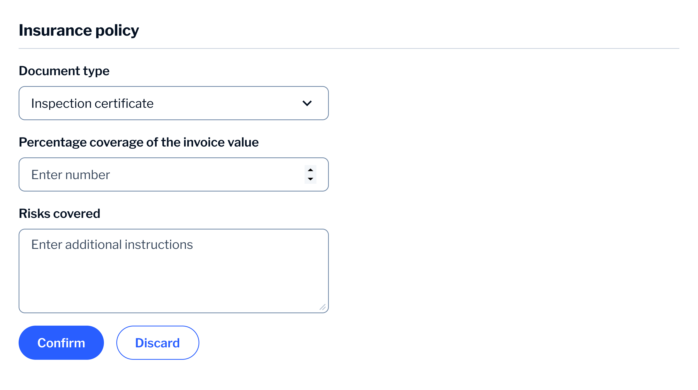
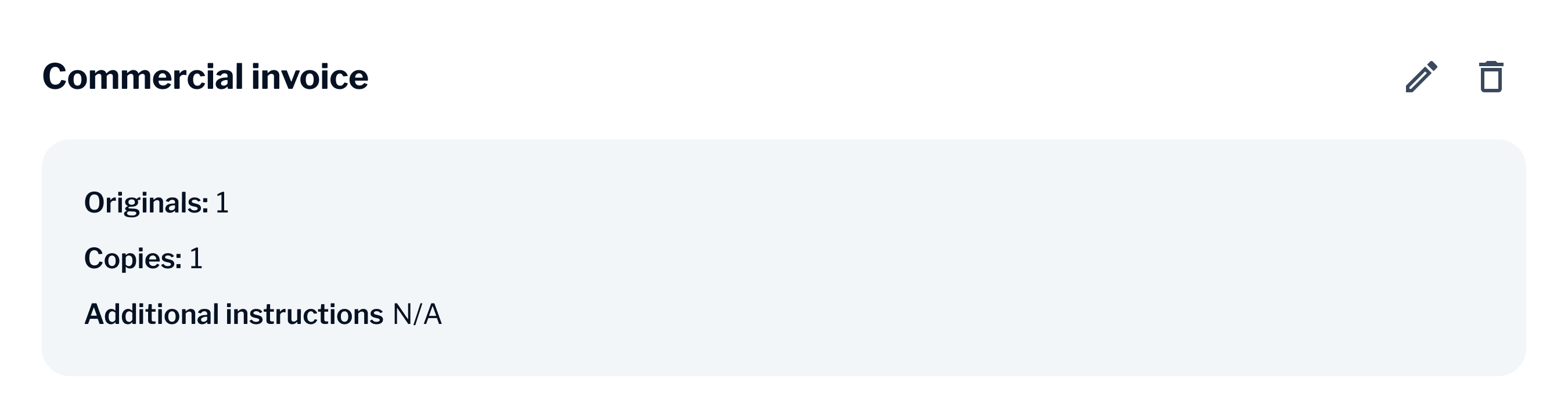
2. Each document is its own little form with its own details like originals, copies and instructions. So I treated each one as a self-contained unit rather than a row in a list. Once you confirm a document it folds up into a summary card on the same page. That way you keep the whole list in view instead of losing your place as you move from screen to screen.
Solution
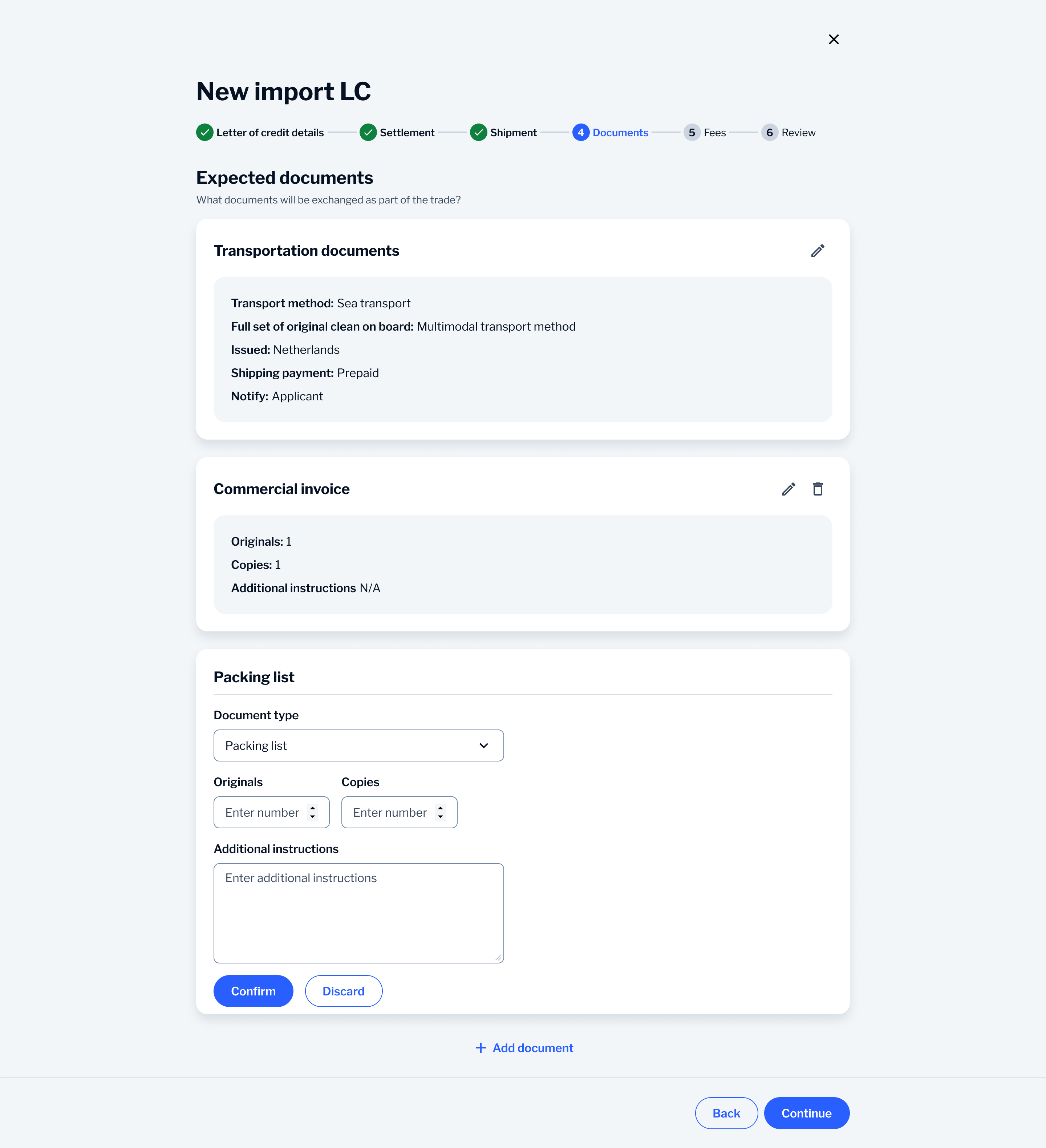
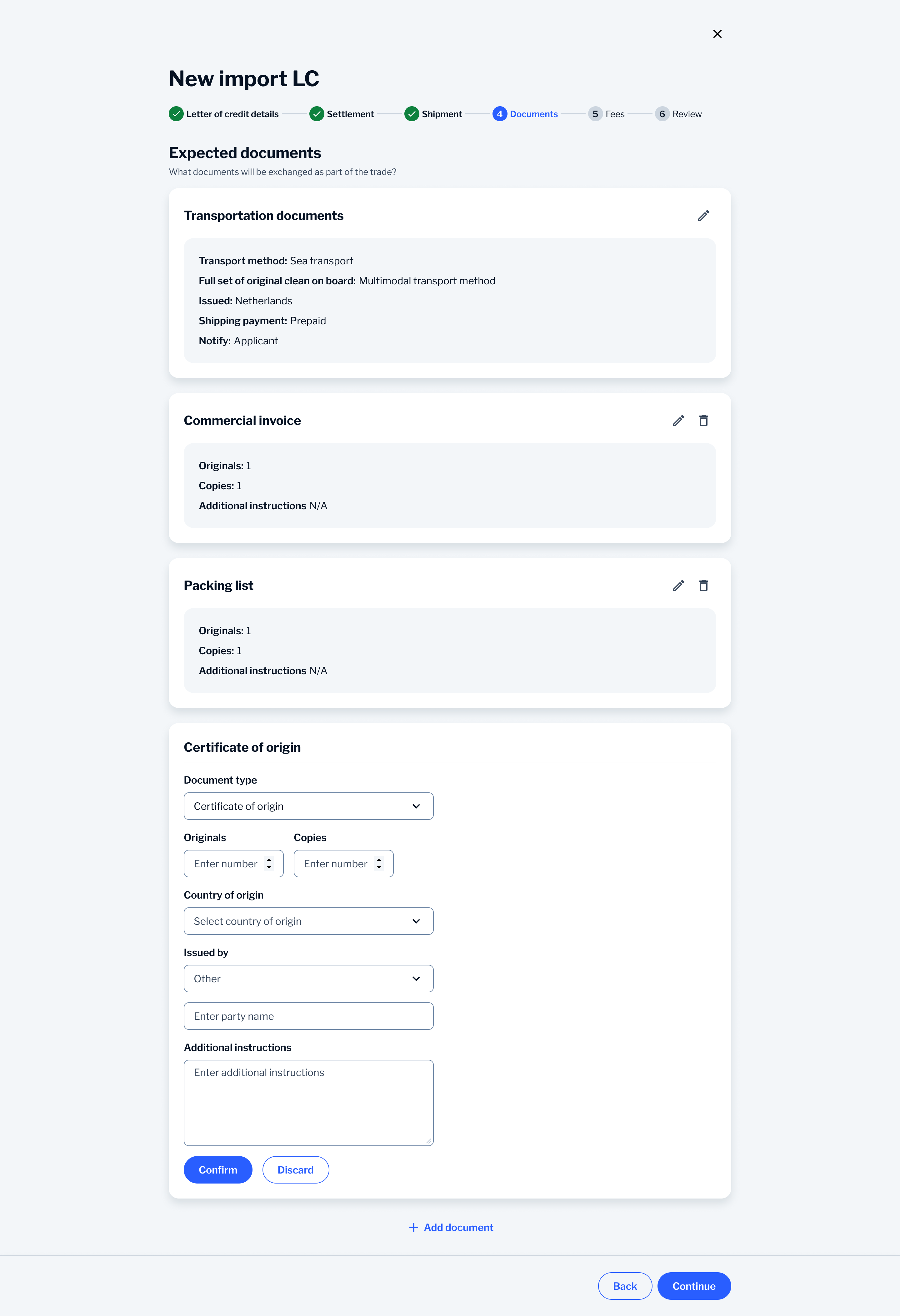
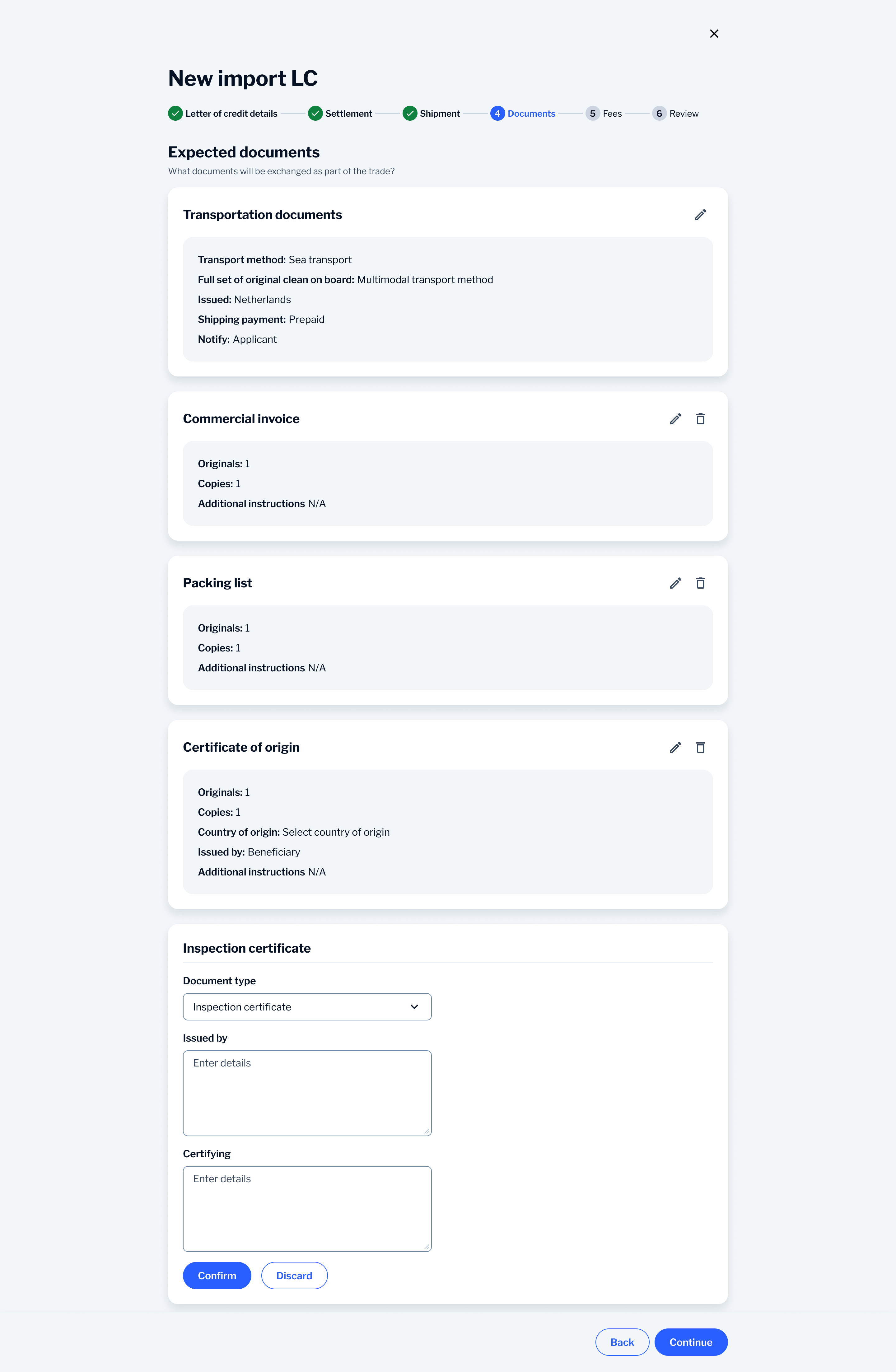
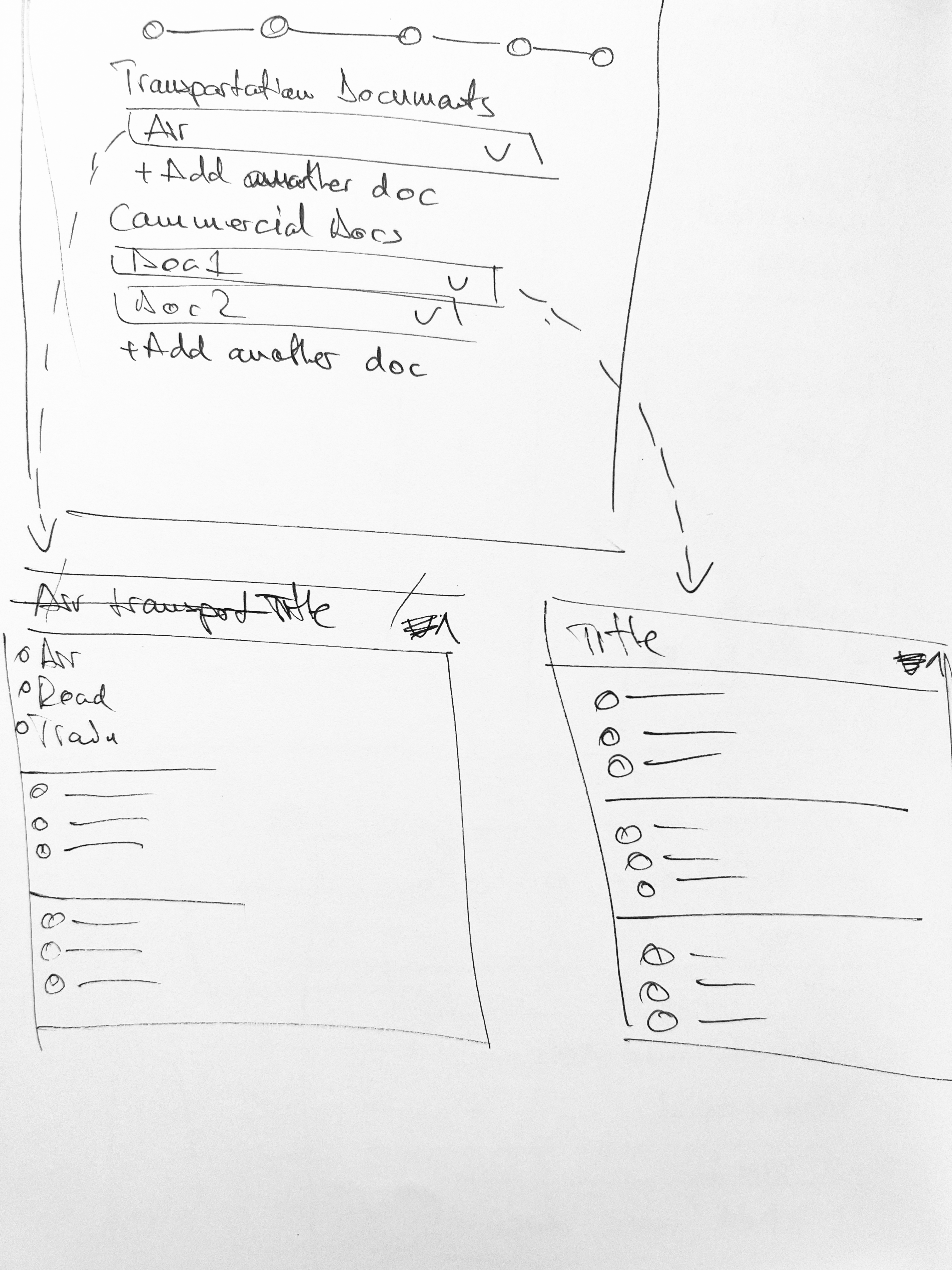
The user adds a document, fills in its details and confirms it. Then it folds into a summary card showing the key info. You can edit any card in place without losing your progress. I used summary cards rather than collapsible ones on purpose. It means you can scan everything you’ve added so far at a glance without clicking to open each one.
This creates a clear interaction pattern:
Add a document
Define its requirements
Confirm and review it as a summary
Edit or remove it if needed
One document at a time
Each document is completed in isolation, reducing the need to process multiple requirements at once.
Cards you can scan, not click open
Key information is surfaced in a compact card, allowing users to verify details without reopening the form.
Add, review or remove as you go
Each document is treated as a repeatable unit, making it easy to add, review or remove items as the list grows.
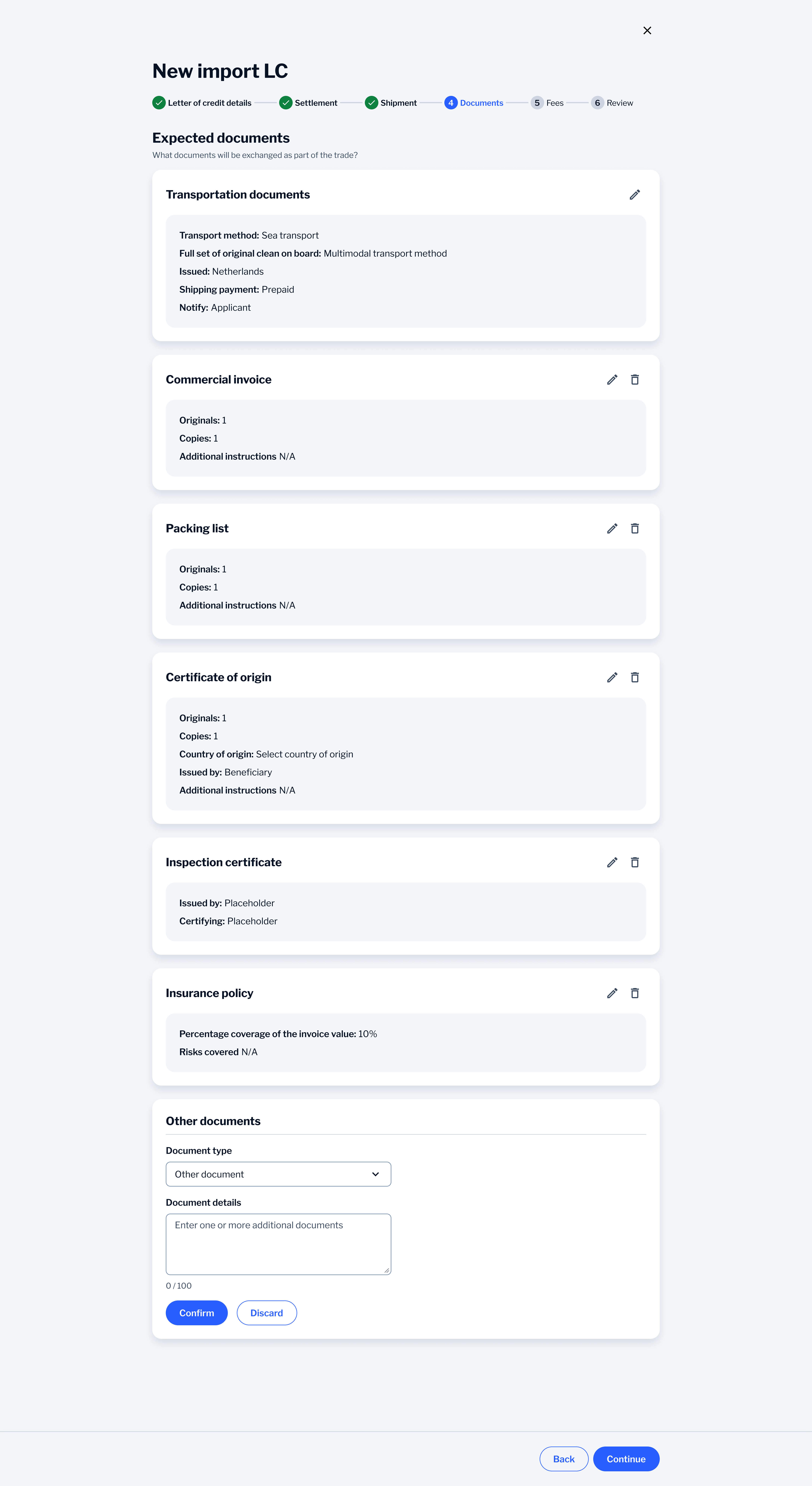
Edit any card without losing your place
Users can update individual documents without affecting the rest of the flow, maintaining a sense of control.

The result keeps the overview you get from a full form and the focus you get from doing one thing at a time. It drops the dense wall of fields from the old version and it avoids the lost context you get from a step-by-step wizard. In a flow where a small mistake can delay the deal or make it fall through, the confirm and review step works as a safety check rather than a hassle.
As more documents are added, the layout remains easy to scan due to clear separation, consistent structure and predictable interactions, preventing the experience from becoming overwhelming.
Outcome
It was adopted across 3 client implementations. The structure was built to cut down on mistakes and reduce how much manual checking was needed in a step where accuracy decides whether payment goes out. It kept the full complexity of the requirements intact while making it something a non-expert could actually complete.